

Keep every essential visual inside the central safe band of your 1080×1920 frame. That means your hook, your captions, faces, and any call-to-action stay clear of three danger zones: the top navigation bar, the bottom caption and CTA strip, and the right-side engagement column where likes, comments, and shares live.
Here's what that looks like in pixels:
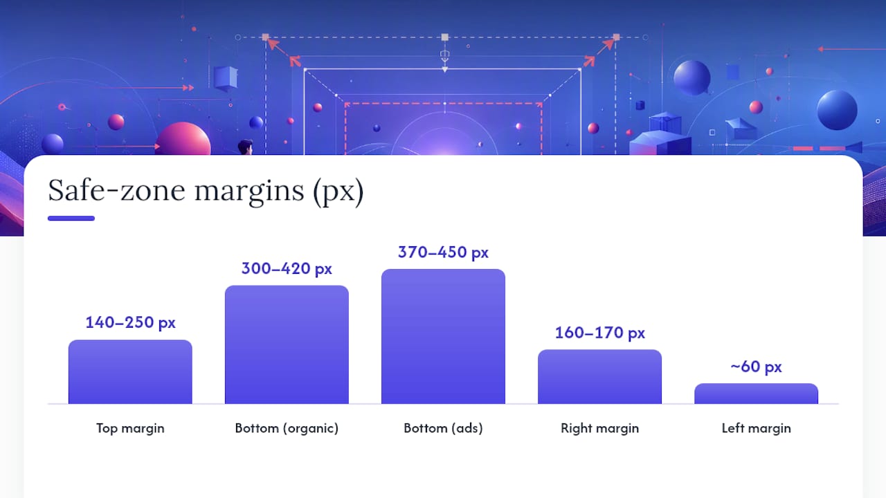
- Top buffer: keep clear roughly the upper 140–250 pixels
- Bottom buffer (organic): roughly the lower 300–420 pixels
- Bottom buffer (ads): tighter by some margin due to CTA buttons and sponsored labels.
- Right buffer: roughly the rightmost 160–170 pixels for the engagement column
- Left buffer: roughly 60 pixels from the left edge.
Quick checklist: Place your hook and subject's face dead center in the top third. Keep captions inside the middle band, never against the bottom edge. Put your CTA above the bottom danger zone, especially in paid placements where the safe zone tightens further.
Key Takeaways
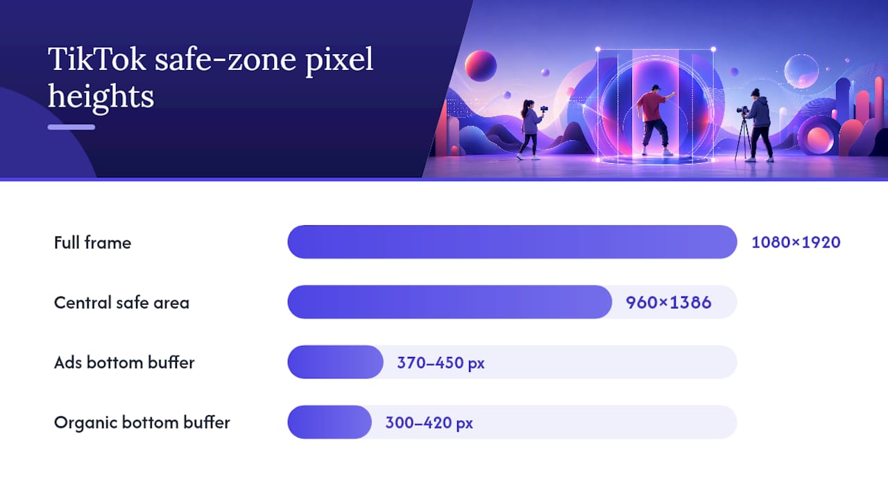
TikTok safe zones require centering text, faces, and CTAs inside a roughly 960×1386 pixel band on a 1080×1920 canvas, with ads demanding tighter bottom margins than organic posts.
Where to Verify Safe Zone Numbers Before Launch
Cross-check your layout against TikTok's official ad specs and the SoCaptions overlay guide before any major paid push.
Table of Contents
- What Are TikTok Safe Zones and Why Do They Matter?
- Pixel-Accurate Safe Zone Measurements for 1080×1920 Video
- Where Does the Right-Side Column Break Most Videos?
- How Do You Test a Video for Safe Zone Compliance?
- Do Safe Zones Change When You Cross-Post to Reels or Shorts?
- How Do Creative Teams Enforce Safe Zones at Scale?
- What's Overrated About Safe Zone Advice, and What Actually Matters
- Frequently Asked Questions
- Sources
What Are TikTok Safe Zones and Why Do They Matter?
A safe zone is the portion of your vertical frame that stays visible no matter what TikTok's interface is doing on top of it. Everything outside that zone risks getting covered by the profile icon, sound button, caption text, or the like/comment/share stack running down the right edge.
TikTok's own ad specifications note that safe zone size shifts depending on the ad dimension, caption length, and whether you're running additional formats like interactive add-ons. That's not a small detail. A caption that runs two lines instead of one pushes your bottom buffer up significantly, and if your CTA sits where that second line lands, it disappears.
A few overlapping UI elements to watch for:
- Username and caption text block (bottom left)
- Music/sound attribution ticker
- Like, comment, share, and bookmark icons (right column)
- Follow button and profile avatar (right column, upper section)
- Progress bar and mute icon (top edge)
Device notches, foldable screens, and TikTok's own UI experiments all nudge these boundaries slightly. Design for the tightest case, not the average one.
Pixel-Accurate Safe Zone Measurements for 1080×1920 Video
Independent measurement tools place the organic safe area in the approximate central band of a 1080×1920 canvas, leaving a significant usable margin on every side, which is often smaller than editors estimate.
Here's the breakdown, combining PostPlanify's 2026 measurements with SoCaptions' production guidance:
| Zone | Pixel Range | What Covers It |
|---|---|---|
| Top | upper 140 to 250 pixels | Progress bar, mute icon, live indicator |
| Bottom (organic) | lower 300 to 420 pixels | Username, caption, sound ticker |
| Bottom (ads) | lower 370 to 450 pixels | CTA button, sponsored label, caption |
| Right | rightmost 160 to 170 pixels | Like, comment, share, bookmark, follow |
| Left | approx. 60 pixels | Minimal, but avoid edge-touching text |
Ad placements lose more real estate than organic posts. TikTok's Interactive add-on specifications warn that logos and text sitting outside the safe zone "may be covered" by the download card or CTA overlay, and that left-to-right and right-to-left templates use different safe-zone files entirely. If you're running the same creative in an Arabic or Hebrew market, don't assume your English-market overlay still applies.
Caption length is the variable most creators underestimate. A one-line caption might sit comfortably at 1500px vertical position. A two-line caption pushes your safe text boundary up to around 1450px or higher, depending on font size. The fix is simple: design every caption box assuming worst-case length, then let short captions sit inside that same box with extra breathing room. Never design for your shortest caption and hope the long ones fit later.
Where Does the Right-Side Column Break Most Videos?
The right engagement column is the single most common place creators lose visibility, and ad-mode testing failures usually trace back to skipping preview checks entirely before launch.
- Bottom-anchored captions. Placing captions flush against the bottom edge is the most frequent mistake, and it's the one that costs the most in ad performance since the CTA button sits right on top of that space.
- Right-aligned text or logos. Anything anchored right of center collides with the like/comment/share stack, especially on ads where the column runs taller.
- Branding in the top-right corner. Watermarks and logos placed there vanish behind the mute icon or live badge on certain device sizes.
- Skipping ad-mode preview. Organic and paid safe zones aren't the same. A layout that clears organic UI can still get clipped once the CTA button and sponsored label load in.
Best-practice checklist:
- Center your hook text and subject's face in the top third
- Style captions with a stroke or background box so they stay legible over any footage
- Use a minimum 40px font size (scaled to canvas) for readability on small screens
- Keep ad creative margins tighter than organic by default, roughly 450px from the bottom
Pro Tip: Check the "busiest frame," the moment where your caption, a graphic, and your subject's face all appear at once, since that single frame reveals every collision your layout will produce.
How Do You Test a Video for Safe Zone Compliance?
Run this sequence before any creative goes live:
- Import a safe-zone overlay template into your editor as a locked top layer.
- Scrub to your busiest frame and check for overlaps between text, graphics, and the overlay guides.
- Preview on a device mockup, ideally more than one screen size, since aspect ratio quirks shift slightly across phones.
- Switch to ad-mode preview to confirm the tighter CTA and sponsored-label buffers don't clip anything.
- Export, then re-import the final file to catch any compression or crop shift.
Where to get the actual files:
- TikTok's official ad spec pages for advertiser-grade safe-zone downloads
- PostPlanify's overlay checker for a fast organic vs. ad comparison
- DominateTools' preview tool for device-size toggling
Add this as a mandatory QA step, not an optional one, and keep a versioned overlay file since TikTok updates its interface multiple times a year.
Do Safe Zones Change When You Cross-Post to Reels or Shorts?
Yes, and treating one platform's safe zone as universal is how creators lose visibility the moment they repurpose a video.
- TikTok has the widest right-side column of the three, so right-margin text is riskiest here.
- Instagram Reels carries heavier bottom overlays, with a caption bar and sharing icons stacked lower.
- YouTube Shorts runs lighter UI overall but is more center-biased, so off-center hooks read worse.
- Profile grid cropping cuts your cover image to roughly a 3:4 ratio, so keep your cover's focal point centered, not near any edge.
When repurposing one video across platforms, nudge vertical text placement up slightly, keep captions centered rather than left or right-biased, and re-run your preview check for each platform separately. A layout that clears TikTok's UI isn't guaranteed to clear Reels' bottom stack.
How Do Creative Teams Enforce Safe Zones at Scale?
Manually checking safe zones on one video is manageable. Checking them across dozens of ad variations, on a weekly cadence, is where most in-house teams fall behind.
A workflow that holds up at scale looks like this:
- Bake a safe-zone overlay into your editing template so every new cut is built on top of pre-marked guides
- Run a busiest-frame check as a required QA gate before any variant ships
- Maintain separate ad-mode and organic-mode templates so CTA buffers are never an afterthought
- Version overlay files each time TikTok updates its interface, and flag stale templates automatically
Teams embedding these checks into their editing pipeline report fewer last-minute reshoots and less wasted render time. This is exactly the kind of repetitive, detail-heavy work that a dedicated virtual assistant pipeline handles well: someone applying the same overlay discipline to every raw clip you hand off, so safe-zone compliance becomes a built-in step rather than a rushed final check.
Pro Tip: If you're producing more than five ad variants a week, assign one person or one VA solely to safe-zone QA. Splitting that responsibility across your whole team is how overlap mistakes slip through.
Jamesyee's managed creative service builds this exact discipline into its ad variation workflow, turning one raw video into multiple safe-zone-checked ad cuts within 24 to 48 hours.
What's Overrated About Safe Zone Advice, and What Actually Matters
Most safe-zone guides treat the topic like a static rulebook: memorize the pixel numbers, apply them once, move on. That's backwards. The numbers shift with caption length, ad format, and TikTok's own interface updates, so a fixed template you built in January can be quietly wrong by summer.
What gets underrated is the busiest-frame test. Creators obsess over where captions sit in isolation but never check the frame where the caption, a graphic overlay, and the subject's face all compete for the same space. That's the frame that actually breaks layouts, not the calm B-roll shot everyone previews first.
The other blind spot is ad-mode complacency. Plenty of teams design beautifully for organic viewing, then get blind sided when the CTA button eats another 50 to 80 pixels off the bottom. If you're only previewing in organic mode, you're testing the wrong product.
Prioritize this: build your overlay checks into the edit template itself, test the worst frame first, and treat every ad launch as a fresh safe-zone check, not a rerun of last quarter's assumptions.
Frequently Asked Questions
What exactly is a TikTok text safe area?
It's the central portion of your 1080×1920 frame, roughly 960×1386 pixels, that stays visible regardless of caption length, UI elements, or CTA overlays. Text and graphics placed outside it risk being covered.
Does the TikTok overlay safe zone differ for ads versus organic posts?
Yes. Ads carry a tighter bottom buffer, typically 370 to 450px versus 300 to 420px for organic content, because CTA buttons and sponsored labels take up extra space.
How do I check if my video respects TikTok safe zones?
Import a safe-zone overlay template into your editor, check your busiest frame against it, then preview in both organic and ad modes using a tool like PostPlanify's checker or DominateTools.
Why does my caption placement work sometimes and get cut off other times?
Caption length changes how much vertical space you need. A one-line caption fits fine near the bottom band, but a two-line caption pushes into the danger zone unless you designed the layout for the longer version from the start.
Do TikTok's safe zones change over time?
Yes. TikTok updates its interface multiple times a year, so overlay files and pixel references need periodic re-verification, especially before major paid campaigns.
Sources
- TikTok Auction In-Feed Ads
- TikTok Safe Zone Checker - Free Overlay Tool (2026)
- TikTok safe zone: 1080×1920 dimensions & caption placement