

Specific, aligned calls to action beat generic ones almost every time, and the gap is not small. Try "Get your free guide" instead of "Submit" and you're working with copy that can lift conversions by up to 202%. Three examples to test right now: "Get 20% off your first order" for ecommerce, "Book my free strategy call" for lead gen, and "See how it works" for cold audiences not ready to buy. The rest of this guide breaks down the full example bank, platform-specific rules, and the exact way to test any of it.
TL;DR:
- Personalized, benefit-specific CTAs can boost conversions by up to 202%, especially when they include clear numbers or benefits.
- Testing should be done by launching new variants rather than editing live ads to avoid performance dips caused by resetting delivery.
- The most effective CTAs combine an action verb, a clear promise or benefit, and a sense of urgency or social proof to maximize engagement.
- Platform-specific rules require matching CTA phrases with the ad format, audience, and device, such as emphasizing benefit in Google RSAs or urgency on TikTok.
- Weekly or biweekly CTA and creative refreshes prevent fatigue, and outsourcing variation production can help maintain campaign momentum without expanding headcount.
Table of Contents
- What Is a CTA, and Why Do Most Ad CTA Examples Fail?
- CTA Examples Organized by Campaign Objective
- The Full CTA Example Library by Tone
- CTA Rules by Platform: Google, TikTok, Meta, and Email
- CTA Anatomy: What Actually Makes One Work
- How to Test CTAs Without Wasting Your Ad Spend
- Copy-Paste CTA Templates and a Pre-Launch Checklist
- Why Most CTA Testing Is Solving the Wrong Problem
- Scale Fresh CTAs Without Adding Headcount
- Sources
- FAQ
What Is a CTA, and Why Do Most Ad CTA Examples Fail?
A call to action is the line or button that tells someone exactly what to do next: buy, sign up, download, book, donate. It's the hinge between an ad's hook and the advertiser's goal, and most ad CTA examples fail for one reason: they describe an action without a reason to take it.
"Submit" tells a person what will happen when they click. It says nothing about what they get. "Sign Up" is functionally identical. Compare that to "Start my free trial" or "Claim your spot," where the benefit rides inside the verb phrase itself. That's the entire mechanical difference between a CTA that converts and one that just sits there being technically correct.
The Forbes Communications Council frames this as a hook-body-CTA sequence: the CTA should feel like the natural next step in a story the ad already told, not a bolted-on instruction. When the CTA breaks that sequence, viewers feel a small jolt of mismatch, and that mismatch is often where clicks die.
CTA Examples Organized by Campaign Objective
Different goals call for different verbs, different urgency levels, and different amounts of friction reduction. Below is a working set organized by the objective most performance marketers are actually running.
Ecommerce and direct purchase
- "Shop the sale, up to 40% off" (works when there's a real discount to lead with)
- "Add to cart, ships free today" (removes the shipping-cost objection up front)
- "Get yours before it sells out" (scarcity, use only when true)
- "Buy now, pay in 4" (names the payment method directly)
- "See sizes and colors" (softer entry for browsers not ready to buy)
- "Grab the bundle and save" (frames a bigger cart as the smart move)
Lead generation and consultations
- "Get my free quote"
- "Book a free strategy call"
- "See if I qualify" (great for anything with eligibility criteria, like financing or insurance)
- "Talk to a specialist"
- "Request early access"
- "Get my personalized plan"
App installs
- "Install free, no card required"
- "Try it free for 7 days"
- "Get the app, start today"
- "Download and unlock your first week free"
- "Join 2 million users" style CTAs work only when the number is real and sourced; don't manufacture one.
Newsletter and content subscriptions
- "Get the free guide"
- "Join the list, no spam"
- "Get weekly tips, unsubscribe anytime"
- "Send me the checklist"
- "Get the report free"
Webinars and events
- "Save my seat"
- "Register free, limited spots"
- "Watch the replay now"
- "Reserve my spot before it fills"
Donations and nonprofit asks
- "Give $25, change a life"
- "Match my donation today"
- "Give monthly, cancel anytime"
- "Sponsor a child today"
Bookings and appointments
- "Book my appointment"
- "Check available times"
- "Reserve my table"
- "Schedule my free consult"
Notice the pattern across every category: the strongest options name a specific benefit, a specific number, or remove a specific worry (cost, commitment, eligibility). Salesforce's guidance on CTAs makes the same point differently: match the action verb and the phrasing to both the intent of the click and what's waiting on the other side of it. A CTA promising "free" that leads to a paywall kills trust for the whole campaign, not just that ad.
The Full CTA Example Library by Tone
Here's where most advertisers get stuck: they have three CTAs they like and no bench of backups when those three go stale. Below is a working library grouped by tone, with micro-variants built in so you can swap a single word and get a fresh test without starting from zero.
1. Urgency and scarcity CTAs
- "Ends tonight, shop now"
- "Only 12 left in stock"
- "Sale ends Sunday"
- "Last chance to save 30%"
- "Doors close Friday"
- "Spots filling fast, register now"
Micro-variants: swap "Ends tonight" for "Ends in 3 hours" and test which time frame creates more pressure without feeling manufactured. Urgency only works when it's true. Fake countdown timers get noticed, and they erode trust faster than a weak CTA ever would.
2. Benefit-led CTAs
- "Save $50 today"
- "Get 2x faster results"
- "Cut your bill in half"
- "Start saving in 5 minutes"
- "Get more leads this week"
- "Double your output, same budget"
Micro-variants: replace a vague benefit with a number. "Save money" becomes "Save $50." "Get more leads" becomes "Get 3x more leads." Numbers make a benefit concrete, and concrete claims outperform vague ones almost every time they're tested head to head.
3. Curiosity-driven CTAs
- "See what's inside"
- "Find out why 10,000 marketers switched"
- "See how it works"
- "Uncover your score"
- "Peek behind the process"
- "See the before and after"
Curiosity CTAs work best on cold traffic, where the viewer doesn't yet know enough to want the specific benefit. They work worst on retargeting, where the audience already knows what you sell and just needs a reason to act.
4. First-person CTAs
- "Get my discount"
- "Start my free trial"
- "Send me the guide"
- "Reserve my spot"
- "Yes, sign me up"
- "Claim my offer"
First-person phrasing puts the reader inside the sentence instead of watching it from outside. Several large-scale ad-library reviews of button performance, including an analysis of 1.7 million Facebook ads, found that ownership language like this shows up disproportionately in high-frequency winning ads, particularly for lower-priced, impulse-driven offers.
5. Low-friction, soft-entry CTAs
- "Learn more"
- "See details"
- "Explore options"
- "Check it out"
- "See if it's right for you"
- "Compare plans"
The takeaway isn't that "Learn More" is universally best. It's that button choice should track the offer: low-friction language fits considered purchases and higher price points, while direct-action language fits impulse buys and low-cost offers.
6. Direct-command CTAs
- "Shop now"
- "Buy now"
- "Sign up free"
- "Get started"
- "Download now"
- "Join now"
7. Question-format CTAs
- "Ready to save 30%?"
- "Want faster results?"
- "Tired of overpaying?"
- "Curious how it works?"
Question CTAs pull double duty. They act as a mini-hook and a CTA at once, which makes them useful on shorter ad formats where character space is tight, like TikTok on-screen text or display headlines.
Pro Tip: Keep a running spreadsheet of every CTA you've tested, tagged by tone and objective. After a dozen campaigns, you'll have a personal performance library that beats any generic list, including this one.
On character limits: most platforms cap headline and button text well under a full sentence. Google RSA headlines max out at 30 characters each, so front-load the benefit and cut filler words like "today" or "now" if space runs tight. Meta's primary text has more room, but the CTA button label itself is fixed to a preset list, which we'll cover next.
CTA Rules by Platform: Google, TikTok, Meta, and Email
A great CTA phrase means nothing if it violates how the platform actually renders ads. Each channel has its own mechanics, and ignoring them wastes good copy.
Google Ads and responsive search ads (RSAs)
RSAs support up to 15 headlines and 4 descriptions per ad, and Google tests combinations automatically to find what performs. That means your CTA phrasing should appear in multiple headline variants, not just one. Google's own guidance notes that adding a second RSA to an ad group can lift conversions by an average of 6.6%, and improving Ad Strength from "Poor" to "Excellent" correlates with a meaningful jump in clicks and conversions.
Practical defaults for Google: use a unique final URL for every RSA, opt into text customization when it's relevant to your industry, and rotate CTA-bearing headlines like "Get a Free Quote," "Shop the Collection," and "Start Today, No Fees" across the same ad group instead of repeating one phrase 15 times with minor tweaks.
TikTok
TikTok ships with more than 20 preset CTA button options, from "Shop Now" and "Learn More" to app-specific buttons like "Install Now" and "Play Now." The button matters less than what happens in the video itself. TikTok's own guidance and broader creative testing both point to the same rule: put a spoken and on-screen CTA in the final two to three seconds of the video. The button sitting under the video rarely gets noticed if nothing in the content points to it.
Meta (Facebook and Instagram)
Meta's CTA buttons are also preset, pulled from a fixed list rather than free text. "Shop Now" fits low-price, high-urgency offers. "Learn More" fits considered purchases or anything requiring explanation before a buy decision. "Sign Up" fits lead gen and subscriptions. Meta allows both static and dynamic creative testing, so you can pair one video with three different CTA buttons in the same ad set and let delivery data pick a direction.
Email and landing pages
The CTA on a landing page has to match the promise in the ad and the subject line that got someone to open the email in the first place. If the ad says "Get 20% off," the landing page headline and the first visible button need to say the same thing, above the fold, without a scroll. Mismatched CTA phrasing between the ad, the email subject, and the landing headline is one of the most common, and most fixable, sources of post-click drop-off.
- Google Ads default: rotate 3 to 5 CTA-driven headlines per RSA, unique final URL each ad
- TikTok default: pinned or dynamic "Shop Now" plus a spoken CTA in the last 3 seconds
- Meta default: match button to price point, "Shop Now" for impulse, "Learn More" for consideration
- Email/landing default: mirror the ad's exact CTA phrase above the fold
CTA Anatomy: What Actually Makes One Work
Break down every CTA that's ever converted well and you'll find the same three parts in different combinations: an action verb, a promise or benefit, and, optionally, urgency or social proof stacked on top.
"Get" is a verb. "20% off your order" is the promise. "Ends tonight" is the urgency layer. Strip any two of those three out and the CTA gets noticeably weaker. Most underperforming CTAs are missing the middle piece entirely. They have the verb and, sometimes, urgency, but no actual benefit spelled out.
First-person versus second-person phrasing is a real, testable variable, not a stylistic preference. "Get my discount" (first-person) frames the click as something the reader is doing for themselves. "Get your discount" (second-person) frames it as an instruction from the advertiser. Neither wins universally. First-person tends to edge out second-person on lower-consideration, emotionally driven offers, while second-person can perform fine on B2B and higher-trust categories where a more direct tone reads as confident rather than personal.
Personalized, specific CTAs can outperform generic ones like "Submit" by up to 202%, and adding a single power word to that copy can push conversions up by close to 13% on top of that.
Design checklist for pairing copy with the button itself:
- Contrast: the CTA button color should be the highest-contrast element on the creative, not just "on brand"
- Size: on mobile, thumb-friendly means the button should be tappable without zooming
- Placement: above the fold on landing pages, in the final third of the frame on video
- Microcopy: a one-line note under the button ("No credit card required," "Free shipping over $50") removes hesitation right where it happens
- Alignment: the button label should use the same words as the ad's headline, not a paraphrase
Before and after: Before: "Click here to learn about our services." Vague verb, no benefit, no urgency. After: "See how we cut ad costs by 31% in 60 days." Specific benefit, timeframe, and a number that gives the reader something concrete to weigh.
The second version does not just sound better. It gives the algorithm and the human reader a reason to click that the first version never offers.

How to Test CTAs Without Wasting Your Ad Spend
Testing a CTA the wrong way can quietly sabotage a campaign that was already working. Here's the process that actually protects your spend while still generating real answers.
- Launch new variants instead of editing live winners. On several platforms, editing the CTA on a top-performing live ad can reset its delivery and send it back into the learning phase, which temporarily tanks performance for no real reason. Duplicate the ad, change the CTA, and launch it as a new variant.
- Watch metrics in order of priority: CTR first, then landing-page conversion rate, then CPA or ROAS. A CTA that spikes CTR but tanks conversion rate isn't a win. It's attracting clicks the landing page can't close.
- Run a real test matrix, not a single swap. A simple 2x2 works well: CTA verb (Get vs. Claim) crossed with framing (first-person vs. second-person), or urgency present versus absent. That gives you four variants and actual signal on which lever mattered.
- Use a statistical-significance calculator before calling a winner, and set a holdout sample size in advance so you're not eyeballing a lead after 40 clicks.
- Feed CTA testing into your RSA asset strategy. Google's own data shows that adding more unique RSA assets and improving Ad Strength correlates with higher conversions, so a CTA test on Search should live inside a broader push for headline and description variety, not a single isolated headline swap.
Pro Tip: Never test more than one variable per matrix cell. If you change the CTA verb and the urgency claim in the same ad, you'll have no idea which one actually moved the number.
Combine CTA copy testing with creative and landing-page variation for the most reliable read. A CTA that wins on one hook can lose on another, so treat the CTA as one part of a larger asset library test, not an isolated experiment.
Copy-Paste CTA Templates and a Pre-Launch Checklist
Ten templates you can drop straight into an ad, swapping in your own numbers and offer:
- "Get [X]% off your first order"
- "Book my free [service] call"
- "Try [product] free for [X] days"
- "Save my seat for [event name]"
- "Get the free [resource] guide"
- "See if I qualify for [offer]"
- "Give $[amount], [impact statement]"
- "Reserve my [appointment/table]"
- "Start my [X]-day free trial"
- "Send me the [checklist/report]"
Same template, specific dollar-relevant swap, ready to launch in minutes.
| Pre-launch checklist item | What to verify |
|---|---|
| CTA and landing page match | Same phrase, same promise, above the fold |
| Final URL uniqueness | Each RSA points to its own tracked destination |
| UTM tags and tracking | Every variant tagged before it goes live |
| Ad Strength / asset variety | Multiple headlines and descriptions per RSA |
| Sample size target | Holdout size set before launch, not after |
For a deeper look at how CTAs should map to what happens after the click, a post-contact roadmap framework is worth reviewing before your next launch, and a quick read on how social proof works online can sharpen the microcopy sitting under your button.
Why Most CTA Testing Is Solving the Wrong Problem
The most common mistake I see is blaming the CTA when the real issue is a tired hook. If a video's first three seconds have been running for six weeks, no button swap fixes the drop in performance, because the CTA never had a chance to matter. Creative fatigue shows up disguised as a CTA problem more often than advertisers expect, and it's worth auditing the hook and body before touching the button copy.
Cadence matters more than most people admit. Weekly CTA and creative refreshes make sense for accounts spending heavily on a small number of ad sets. Biweekly is fine for smaller budgets. Either way, once testing and creative production start eating more time than the strategy work that's supposed to justify the spend, that's the signal to bring in managed support rather than keep stretching a lean team thinner.
— James
Scale Fresh CTAs Without Adding Headcount
There are services that offer turning one raw video into multiple ready-to-test ad variations, with new CTA and hook combinations delivered on a fast weekly cycle instead of waiting on a production calendar.
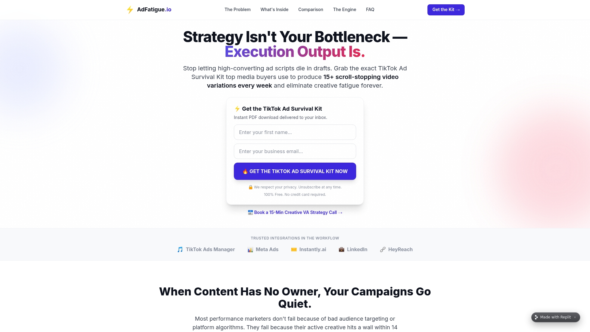
Dedicated virtual assistants can handle the editing, variant production, and creative fatigue diagnostics so teams can focus on the testing matrix instead of the timeline. If your CTA tests keep stalling because the creative behind them never changes, that's a production bottleneck, not a copywriting one. Check out how the ad fatigue solution works and see current pricing and turnaround options for your next campaign.
Sources
FAQ
What Are Examples of a CTA in an Ad?
Common examples include "Shop now," "Get my free quote," "Start my free trial," and "Book a free consult." The strongest versions pair an action verb with a specific benefit, like "Save $50 today" rather than a vague command like "Click here."
Can You Give Examples of Ads With Strong CTAs?
A lead-gen ad might run "See if I qualify" to reduce commitment anxiety, and a SaaS ad might use "Start my free trial, no card required" to remove the cost objection up front.
What Is a CTA Example in Marketing?
A CTA example is any specific phrase telling someone what to do next, such as "Download the free guide" or "Reserve my spot." Personalized, benefit-specific CTAs consistently outperform generic ones like "Submit" or "Click here."
What Is a CTA in Advertising?
A CTA in advertising is the instruction, usually a button or closing line, that tells a viewer what action to take after seeing an ad. Salesforce's guidance notes it should match both the offer and the intent of whoever is seeing it, whether that's buying, signing up, or learning more.
How Often Should I Refresh My Ad CTAs?
Accounts spending heavily on a small number of ad sets benefit from weekly CTA and creative refreshes, while smaller budgets can run on a biweekly cycle. If refresh work starts crowding out strategy time, that's usually the point to bring in managed creative support like Jamesyee.