

Produce your Feed creative at 4:5, your Stories and Reels at 9:16, and keep one 1:1 asset as your universal fallback. If you only have time for one export, make it 1:1. If you have a full production sprint, build 9:16 first, then crop to 4:5 and 1:1. The reasoning is simple: taller formats claim more of the screen, and Meta's placements behave differently enough that a single flat ratio leaves performance on the table.
TL;DR:
- Building a 4:5 aspect ratio for Feed placements boosts visible screen space by approximately 25 percent compared to square assets, improving user engagement.
- Meta recommends uploading 1:1 files, but open interface prompts favor square crops, which may lead to undesirable center-cropping in certain placements like Reels and Stories.
- Creating a vertical master at 4K resolution allows for efficient cropping into 9:16, 4:5, and 1:1 formats, reducing production time and maintaining quality across variants.
- When repurposing assets, use a 9:16 master for Stories and Reels, then crop down for other placements, instead of re-editing each ratio from scratch.
- Automated or managed creative workflows can produce multiple optimized ratios within 24 to 48 hours, significantly decreasing creative fatigue and lowering cost per acquisition.
Table of Contents
- What Are the Best Ad Aspect Ratios to Produce First?
- Why Do Meta's Upload Prompts Conflict With Placement Guidance?
- How Do Other Ad Platforms Handle Aspect Ratios?
- What's the Best Production Workflow for Multiple Ratios?
- Can Automation Handle Multi-Ratio Ad Production at Scale?
- Why Do Aspect Ratios Look So Inconsistent Across Ad Platforms?
- How Much Do Aspect Ratios Actually Affect Ad Performance?
- How Should You Adapt Creatives Across Devices and Screen Sizes?
- How Do Aspect Ratios Affect Accessibility and Inclusivity?
- How Do You Test and Optimize Aspect Ratios in Live Campaigns?
- How Should You Prioritize Aspect Ratio Production This Sprint?
- Stop Rebuilding the Same Video Five Times
- Sources
- FAQ
What Are the Best Ad Aspect Ratios to Produce First?
Every campaign should start with the same three exports, and the order you build them matters almost as much as the ratios themselves.
| Aspect ratio | Recommended pixels | Primary use | File types |
|---|---|---|---|
| 9:16 | 1080×1920 | Stories, Reels, full-screen video | MP4, MOV |
| 4:5 | 1080×1350 | Mobile Feed (image and video) | PNG, JPG, MP4 |
| 1:1 | 1080×1080 | Carousel, Marketplace, cross-placement fallback | PNG, JPG, MP4 |
| 1.91:1 | 1200×628 | Google responsive display, link ads | PNG, JPG |
| 16:9 | 1920×1080 | YouTube, landscape video, right column | MP4, MOV |
A few things to keep in mind when you're pulling files together:
- Video files should stay under the platform's max size limits (Meta generally caps at 4GB for video uploads, though smaller files upload and process faster).
- If your team can only export one asset per campaign, 1:1 crops predictably across almost every placement, which is why it survives as the default fallback even in a 2026 media mix dominated by vertical video.
- Image assets should stay in PNG or JPG; video assets should be MP4 with H.264 encoding for the broadest compatibility.
None of these ratios exist in isolation. A carousel card shot at 1:1 will look fine in Feed and Marketplace, but the same file dropped into a Reels placement gets pillarboxed with black bars on either side, which tanks watch time. That's why the next section matters more than the table above.
Why Do Meta's Upload Prompts Conflict With Placement Guidance?
Open Ads Manager and the upload flow asks for 1:1, 9:16, and 1.91:1 crops. Scroll into the placement-level specs, though, and Meta's own guidance recommends 4:5 for most Feed placements. That's not a bug. It's a gap between what the interface defaults to and what actually performs best once the ad renders on a phone screen.
The mismatch causes real damage. Advertisers upload a 1:1 square because that's what the flow suggests, and Meta auto-crops it into whatever the placement needs. You lose control over what gets cut. A product shot that was perfectly framed at 1:1 might get center-cropped when a placement calls for something taller, chopping off a logo or a hand holding the product.
Here's how to think about each major placement:
- Feed (mobile and desktop): Recommended ratio is 4:5, at roughly 1080×1350. This single change gives you about 25% more screen real estate than a 1:1 square as a user scrolls past, because the taller frame occupies more vertical space before the next post appears.
- Stories and Reels: Full 9:16, built at 1080×1920. Anything shorter gets letterboxed with brand-colored or blurred bars, which reads as low effort to anyone scrolling fast.
- Marketplace: 1:1 remains the safest bet here since Marketplace grids display square thumbnails by default.
- Carousel: Stick with 1:1 across all cards. Mixing ratios within a single carousel creates visual inconsistency as users swipe.
- Right column (desktop): This older placement still favors square or near-square crops, though it carries a fraction of the impression volume it once did.
- Audience Network: Treat this like a mixed bag. Some inventory renders vertical, some renders square, so a 9:16 master with a 1:1 crop-in covers most of it.
Meta doesn't reject a mismatched upload. It auto-crops taller-than-supported creative into a center crop, which means your safe zone planning determines whether the crop looks intentional or careless. For 9:16 assets, keep your logo, headline text, and call-to-action button clear of the top and bottom edges, since Stories and Reels overlay UI elements like profile icons, captions, and swipe-up prompts in those zones.
On the video encoding side, stick to H.264 video compression with AAC audio around 128kbps, square pixels, and a fixed frame rate. Export at the native resolution for the ratio you're targeting rather than upscaling a smaller file. Upscaled video introduces visible artifacts the moment Meta's compression touches it a second time.
Statistic Callout: Switching a Feed placement from 1:1 to 4:5 gives the creative approximately 25% more visible screen real estate on mobile, without changing a single frame of the actual footage.
Pro Tip: Before you launch, run every placement through Meta's ad preview tool and check each one individually. Name your export files by ratio (like campaign_launch_9x16.mp4) so nobody on the team accidentally drags a square file into a Reels-only ad set.
How Do Other Ad Platforms Handle Aspect Ratios?
Meta might dominate your media plan, but the rules change the moment you move budget elsewhere.
- Google Ads: Responsive display and search ads lean on 1.91:1 (1200×628) and 1:1 (1200×1200) as the two workhorse sizes, since Google's system recombines assets automatically across whatever inventory is available. Skipping either size shrinks your eligible placements.
- TikTok and Snapchat: Both are 9:16-first platforms. A horizontal asset dropped into either feels like a compromise, not a native ad, and viewers notice instantly.
- YouTube: 16:9 is still the standard for in-stream and discovery ads, though Shorts has pushed 9:16 into heavier rotation for that specific placement.
- Programmatic and responsive display: Prioritize the sizes that unlock the most inventory first, meaning 1200×628 and 1200×1200, before you bother with niche banner dimensions.
- When repurposing footage cross-channel: Build your 9:16 master, crop a 4:5 and 1:1 for Meta, then reuse the 1:1 crop for Google's square slot and the 9:16 original for TikTok and Snapchat without any further editing.
The pattern across every platform is the same: vertical dominates native, social-first placements, while horizontal formats survive mainly in display and YouTube's traditional in-stream slots.
What's the Best Production Workflow for Multiple Ratios?
Building each ratio from scratch wastes hours you don't have. A vertical-first workflow solves that.
- Shoot or compose at a tall master resolution, ideally 4K vertical or at minimum 1440×2560, so you have enough resolution to crop down without losing quality.
- Edit the full 9:16 version first. Lock your pacing, captions, and sound design here, since this is your highest-detail cut.
- Crop to 4:5, keeping your subject and key text within the center frame. This is usually a straight crop, not a re-edit, if your original composition kept action centered.
- Crop to 1:1 or 1.91:1 as needed, tightening further for the square or horizontal formats your campaign requires.
- Export using consistent presets: H.264 video, AAC audio near 128kbps, and a fixed frame rate across every ratio so nothing looks mismatched when placements sit side by side in a feed.
- Name every file by campaign and ratio, something like
PRODUCT_LAUNCH_v1_9x16.mp4, which prevents the wrong-ratio file from landing in the wrong ad set during a rushed upload. - Run a QA pass checking safe zones, text legibility at thumbnail size, and a live placement preview before anything goes live.
Batch exporting all four or five ratios from one locked master, rather than re-editing per ratio, is what separates a team producing five ads a week from one producing fifty.
Pro Tip: Keep one master project file with locked safe-zone guides layered on top. Every editor on the team should pull from that same file, not a personal copy, or your ratios will drift in tiny inconsistent ways across every new campaign.
Can Automation Handle Multi-Ratio Ad Production at Scale?
Most in-house teams hit a wall once campaign volume outpaces editing capacity. Producing five ratio variants of every new hook, multiplied across a dozen active campaigns, turns into a full-time job fast.
This is the gap managed creative services are built to close. A raw video comes in, and a dedicated production workflow turns it into more than ten optimized variants across 9:16, 4:5, and 1:1, each cropped and safe-zoned for its intended placement rather than auto-cropped by the platform.
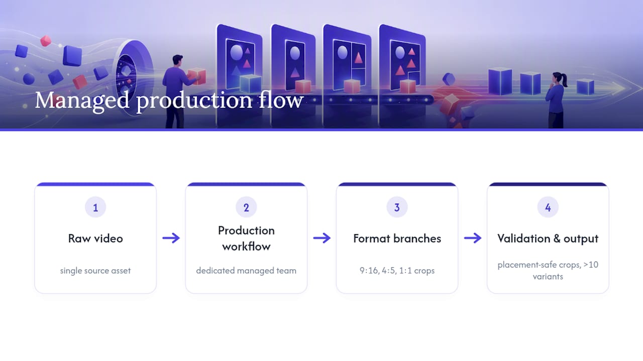
A managed creative service approach to this problem addresses operational challenges such as quicker turnaround times than traditional creative agencies, potential reductions in cost per acquisition through fresh, correctly formatted multi-ratio creative, and a workflow focused on volume and variation to alleviate creative fatigue rather than producing a single polished hero asset.
Choose managed automation when your bottleneck is capacity, not strategy. Keep production in-house when your ratio count and campaign volume are still small enough that one editor can batch everything in an afternoon.
Why Do Aspect Ratios Look So Inconsistent Across Ad Platforms?
Aspect ratios weren't designed around phones. The 4:3 ratio came from early television and photography standards, while 16:9 emerged in the 1990s as the compromise between cinema widescreen and broadcast TV. Neither was built with a five-inch vertical screen in mind.
Social platforms flipped that logic on its head. Once Snapchat and then Instagram Stories proved that full-screen vertical video held attention better on a phone held upright, 9:16 stopped being a niche format and became the default expectation for anything meant to feel native. TikTok cemented it further by building its entire interface around vertical playback with almost no horizontal alternative.
Meta's 4:5 ratio is a middle ground born out of necessity. Feed placements needed something taller than square to compete for scroll attention, but not so tall that it looked awkward sitting between other posts, comments, and UI chrome. The result was a ratio that's neither fully vertical nor square, and it's stuck around because it works.
Meanwhile, 1.91:1 survives almost entirely because of Google's display network and its legacy web-banner roots. Advertisers didn't choose it for aesthetics. They kept using it because it fills the widest range of ad slots across the open web without requiring a separate crop for every placement.
Understanding this history explains why no single ratio wins everywhere: each one solved a specific screen problem at a specific moment, and none of them ever fully replaced the others.
How Much Do Aspect Ratios Actually Affect Ad Performance?
Screen real estate is the mechanism, and it's measurable. A 4:5 image occupies roughly a quarter more vertical space than a 1:1 square in the mobile Feed, which means it stays in view longer as someone scrolls, and a longer view window generally means more chances for a message to register.
Video behaves the same way, but the stakes are higher because motion competes directly with a thumb that's already moving. A 9:16 video that fills the entire screen in Stories or Reels removes every visual distraction around it. A horizontal video squeezed into that same placement gets boxed in on the top and bottom, and the exposed dead space becomes a visual cue that this ad wasn't made for where it's showing up.
Marginal gains compound at scale. A few points of extra click-through rate or viewability on a 4:5 creative might look small in an isolated A/B test, but run that lift across a media budget spanning dozens of ad sets and it adds up to a meaningful shift in blended cost per result. That's the practical argument for treating ratio-specific production as a real line item in the budget rather than an afterthought handled by whoever has five spare minutes.
The inverse is just as true. A poorly cropped or letterboxed asset doesn't just underperform. It actively signals low effort, and audiences that scroll social feeds all day are unusually good at spotting content that wasn't built for the format they're seeing it in.
How Should You Adapt Creatives Across Devices and Screen Sizes?
Screen size variation inside a single ratio is often overlooked. Two phones can both display a 9:16 video, but one has a notch, a punch-hole camera, or rounded corners eating into the visible frame, and another has none of that.
Design with margin, not exact pixel placement. Assume a portion of the outer frame on any device might be obscured by hardware, UI chrome, or a platform's own overlay elements, and keep critical text and logos well inside the center of the canvas rather than tight against any edge.
Tablets and desktop browsers complicate things further. A 4:5 Feed ad built for mobile can look oddly narrow on a wide desktop monitor, so if desktop Feed is a meaningful chunk of your delivery, check the placement preview on both device types before launch rather than assuming mobile framing translates cleanly.
Foldables and split-screen multitasking add one more wrinkle worth a mention, even if they're a smaller share of impressions today. Text that reads fine on a full 1080×1920 canvas can become cramped or awkwardly cropped mid-fold. There's no universal fix here beyond building in generous margins and testing on a couple of real devices before a campaign goes wide, not just relying on a desktop preview panel.
The safest general rule: design for the smallest, most cluttered version of a screen you can reasonably expect, and everything larger or cleaner will simply look better than intended.
How Do Aspect Ratios Affect Accessibility and Inclusivity?
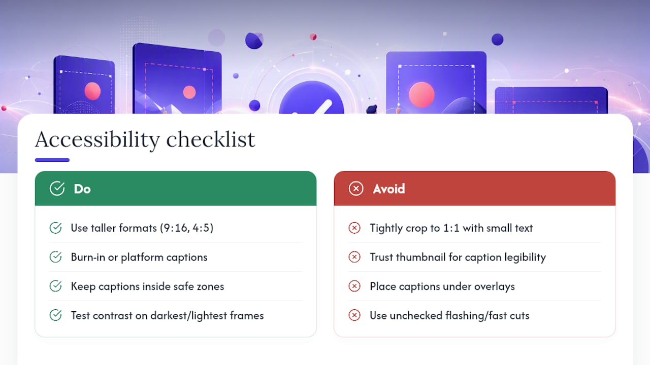
Aspect ratio choices have real accessibility consequences that rarely make it into a creative brief. A tightly cropped 1:1 square leaves less room for text, which forces smaller font sizes that are harder to read for anyone with low vision or who's viewing the ad on an older, lower-resolution device.
Taller formats like 9:16 and 4:5 give you more vertical room to increase text size without crowding the frame, which benefits every viewer but especially those relying on larger text settings or screen magnification. Captions matter just as much as ratio. Since most social video plays with sound off by default, burned-in captions or platform-native caption tools aren't optional for viewers who are deaf or hard of hearing, and they need to sit inside the safe zone so an overlay doesn't cover them.
Color contrast becomes more urgent, too, when text sits on top of moving video rather than a static background. A caption that's legible on a bright still frame can disappear entirely during a darker scene transition. Test your captions against the darkest and lightest frames in the video, not just the thumbnail.
Motion sensitivity is worth a passing thought as well. Fast cuts and flashing transitions common in short vertical video can be genuinely uncomfortable for viewers with vestibular disorders or certain seizure triggers. None of this requires abandoning fast-paced editing. It just means giving captions, contrast, and pacing the same deliberate attention you already give to the ratio and resolution of the file itself.
How Do You Test and Optimize Aspect Ratios in Live Campaigns?
Treat ratio as a variable you test, not a setting you configure once and forget. Run the same creative concept in both 4:5 and 1:1 within the same campaign structure and compare cost per result at the placement level, not just the campaign level, since blended reporting hides which specific ratio is carrying or dragging performance.
Give each test enough spend to exit the learning phase before drawing conclusions. A ratio comparison that gets shut down after a day or two of erratic delivery tells you nothing useful. Watch frequency and watch time alongside cost per result, because a ratio that wins on cost but loses on watch time might be winning through sheer impression volume rather than genuine audience interest.
Refresh the winning ratio's creative on a regular cadence even after you've settled on it. Ratio performance isn't static. A 9:16 video that crushed it in January can fatigue by March simply because the same audience has seen the same framing repeatedly, even with different footage inside it.
Keep a simple log of which ratio won for which placement and objective. Patterns emerge fast once you've run five or six of these tests, and that log becomes your team's fastest reference the next time someone asks which format to prioritize for a new launch.
How Should You Prioritize Aspect Ratio Production This Sprint?
If you're deciding what to fix first, start with Feed. Switch any live campaign still running 1:1 in Feed over to 4:5 immediately, since that single swap captures the biggest, cheapest win available. Add a proper 9:16 export for any ad set touching Reels or Stories. Keep one 1:1 asset on hand as your fallback for carousel and Marketplace.
Validate it fast. In week one, run a 4:5 versus 1:1 split on your best-performing Feed ad, and separately check whether a dedicated 9:16 cut outperforms a stretched or letterboxed horizontal video in Reels. Track results at the placement level, not the campaign level, or the wins get buried in blended reporting.
— James
Stop Rebuilding the Same Video Five Times
If your team is still hand-cropping every hook into 9:16, 4:5, and 1:1 one ratio at a time, you're spending editor hours on a problem that scales badly the moment your ad volume grows. Jamesyee's virtual assistants take a single raw video and turn it into more than ten placement-ready variants across every ratio your campaigns need, typically within 24 to 48 hours, which is far faster than most in-house teams or traditional agencies can turn around a full batch.
This setup fits performance marketers, e-commerce brands, and agencies running enough ad volume that creative fatigue is a constant fight rather than an occasional nuisance. Teams using this workflow have reported a 31% drop in cost per acquisition simply from keeping fresh, correctly formatted creative in rotation instead of running the same crop until it stops converting. If your bottleneck is production capacity rather than strategy, see how the managed creative workflow works and get a sense of turnaround and pricing for your next batch of hooks.
Sources
- Meta Ads Help — recommended sizes and placements
- Meta Ads Aspect Ratios: Every Placement, Every Format — Ads Uploader
- Facebook ad sizes and specs cheat sheet for 2026 — Hootsuite
- Google Ads Help — ad formats and specs
FAQ
What Are the Facebook Ad Sizes for 2026?
The current core sizes are 1080×1350 (4:5) for Feed, 1080×1920 (9:16) for Stories and Reels, and 1080×1080 (1:1) as a versatile cross-placement fallback.
Is It Better to Use 4:5 or 16:9?
For Meta Feed placements, 4:5 wins because it fills more of the mobile screen and gains roughly 25% more visible space than a square crop; 16:9 is better suited to YouTube and horizontal display inventory rather than native social feeds.
Do Meta Ads Allow a 9:16 Aspect Ratio for Video Ads?
Yes. Meta fully supports 9:16 video at 1080×1920 for Stories, Reels, and other full-screen placements, and it's the recommended ratio for those specific spots.
Is 1920×1080 a 16:9 Aspect Ratio?
Yes, 1920×1080 divides down exactly to 16:9, which is the standard resolution for YouTube and most landscape video placements.
What Ratio Should You Pick if You Can Only Produce One Asset?
Default to 1:1 at 1080×1080, since it crops the most predictably across Feed, Marketplace, and Carousel placements when you don't have time to build separate exports for every format.